通过 matplotlib 绘制图表。
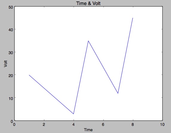
曲线图
1 | import matplotlib.pyplot as plt |
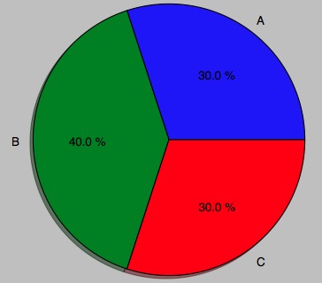
饼状图
1 | import matplotlib.pyplot as plt |
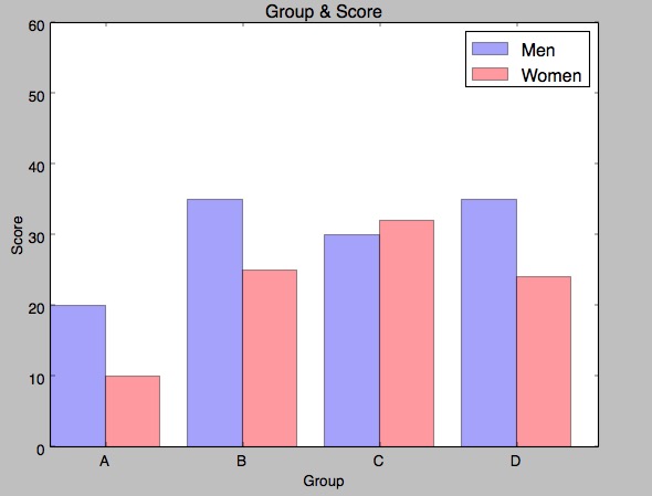
柱状图
1 | import matplotlib.pyplot as plt |
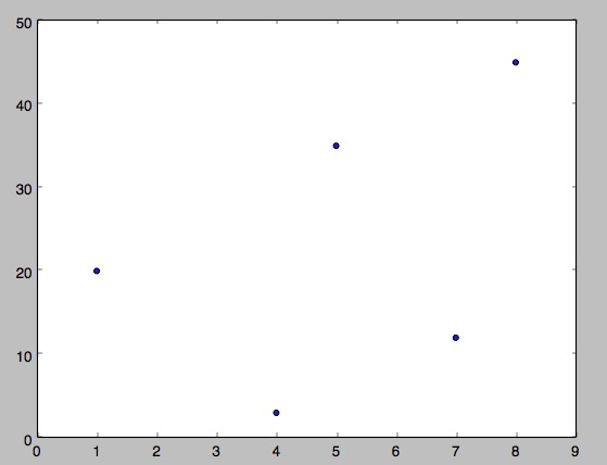
散列图
1 | import matplotlib.pyplot as plt |
保存图
1 | import matplotlib.pyplot as plt |
通过 matplotlib 绘制图表。
1 | import matplotlib.pyplot as plt |
1 | import matplotlib.pyplot as plt |
1 | import matplotlib.pyplot as plt |
1 | import matplotlib.pyplot as plt |
1 | import matplotlib.pyplot as plt |